I’m going to ask you to picture a bold interior room in your head. What immediately comes to mind?
How to go BOLD. Do you envision a room so intense that it overwhelms? Too much color, too much pattern, too much of both? That’s usually what happens when I ask potential clients this question. They go to extremes in their imagination and the resulting imagery isn’t what they want in their own homes.
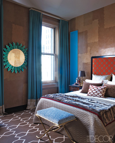
What if I said you can have a bold look in your home without going crazy? It can happen. With a plan of attack and the knowledge of your favorite colors, you can have the bold yet comfortable home that doesn’t scream of overwrought design.
When asked, “what is your favorite color?”, almost no-one answers beige. So why is it we live in such fear for color? The design industry may have something to do with it. For decades there has been a trend towards using neutrals as a base and if warranted the judicial use of controlled brighter tones to help flesh out a room. Seems like sound advice, Yes? Except when the room you’re designing ends up being cold, lifeless or just plain jane in appearance. If that’s the case, then it’s time for a color injection.
“Your attitude is like a box of crayons that color your world.” ~Allen Klein
 Life is about color, all you have to do is walk outside to see that. Beautiful gardens bursting with color, blue skies, even the desert has intense colors going for it and yet most of us shy away from it and choose what we think is “safe” i.e. neutrals. If the quote from Allen Klein is any indication of how colors affect our lives, then it might be worth adding more color to yours to fill it with joy instead of the alternative.
So how do you start? It’s easy, first pick your favorite color. Then pick coordinating colors to go with it. This is where the fun can begin. For simplicity, here’s a link to understanding color harmony at Sensational Color. Once you’ve decided which version of color harmony you like you can be off and running.
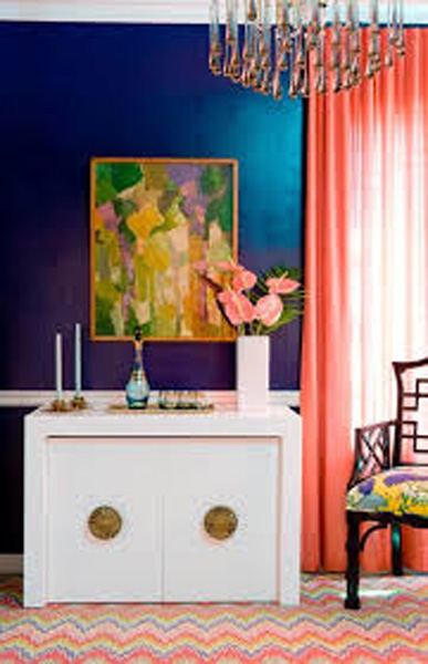
Next there’s the ever solid advice called the “60-30-10 Rule” which states that you can use your dominate color for 60% of the room’s space, 30% for the complimentary color and 10% for the accent color. So let’s say the wall color takes up 60% of your over all design scheme, then you have other colors to use with furnishings and etc. Let me make it clear that this formula doesn’t mean one has to start with the dominate color being a neutral unless desired.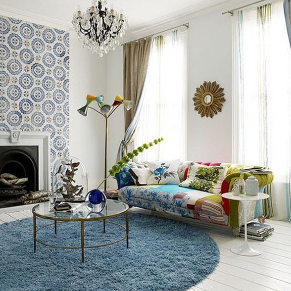
A big tip when planning a room is NOT to select the wall color first. Why? It is because paint is the least expensive thing in your design scheme. I’ve seen many cases where the client picked a color for the walls and then had a hard time selecting furniture to go with it. There are far more choices of paint tones then there are sofas, so if you have your eye on the brightly colored sofa, get that first. Then work your way around it with items to compliment
Since color choices are highly subjected to personal tastes, select what you like regardless of what is trendy. After all it’s your home. You need to wake up every morning and come home at the end of the day to a home that speaks volumes of your multi-layered persona.
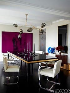
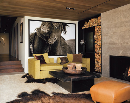
Of course we wouldn’t be complete without mentioning that every photo here shows a mix of new and revamped furnishings to create a wonderful home.
*Don’t worry about making your life sedate, if you live in a neutral themed home odds are it’s already there. Instead, worry about not making it a rich experience. Color can add the richness into your interior and conversely – into your life.